Our company was preparing to launch a new product targeting contractors. Our decisions and designs up to this point had been based on early-stage research with potential customers, but due to the fast-paced nature of software delivery, achieving business goals, and trying to stay ahead of the competition, we did not have the luxury of consistently testing new workflows and designs for validation. To attempt to counteract this, our team came up with the idea of combining moderated usability testing with training sessions. We would train our closed-beta clients on how to use the software in its current state, while uncovering opportunities to improve workflows that didn’t connect with their mental models.
For this stage of our rollout, we were working with three primary personas:
Managers - those who were buying our product for their teams. Managers needed to feel that they were getting their money’s worth. They took a risk on a brand new platform and need to see some of the rewards up front.
Accountants - these were our power users. Making their job easier and more efficient was the key to winning their trust, and the primary problem we set out to solve. They were going to be the person using the program the most, and would be the most likely to have questions and need support along the way, so they were the best resource for us to discover problems and opportunities.
Subcontractor partners - these are our secondary users. Our product is a collaborative software, so diagnosing and fixing any major problems they encounter will clear the way for upstream adoption.
Another way this differed from traditional usability testing is that we were committed to doing these sessions with every closed beta participant, instead of capping it at a specific number, which best practices advise to be anywhere from 5-8.
Looking back on our previous research, we wanted to ensure that our users could achieve their primary goals:
Track vendor compliance (risk mitigation)
Pay vendors in good standing quickly (core business)
Collect invoices and other documentation (risk mitigation)
Watching our users do this live was the best way to get to the “why” fast. We could dig deeper when a problem occurred, and unearth what the customer was expecting to see in the product and didn’t.
The secondary goal was to validate our existing product roadmap and/or discover unanticipated user needs. It’s hard to adequately evaluate the effectiveness of a program that you aren’t intricately familiar with. As our beta clients continue to increase their level of proficiency with the current version of the app, they could potentially want new functionality that supports areas of their workflow that we weren’t already cognizant of, and we needed to be prepared to listen.
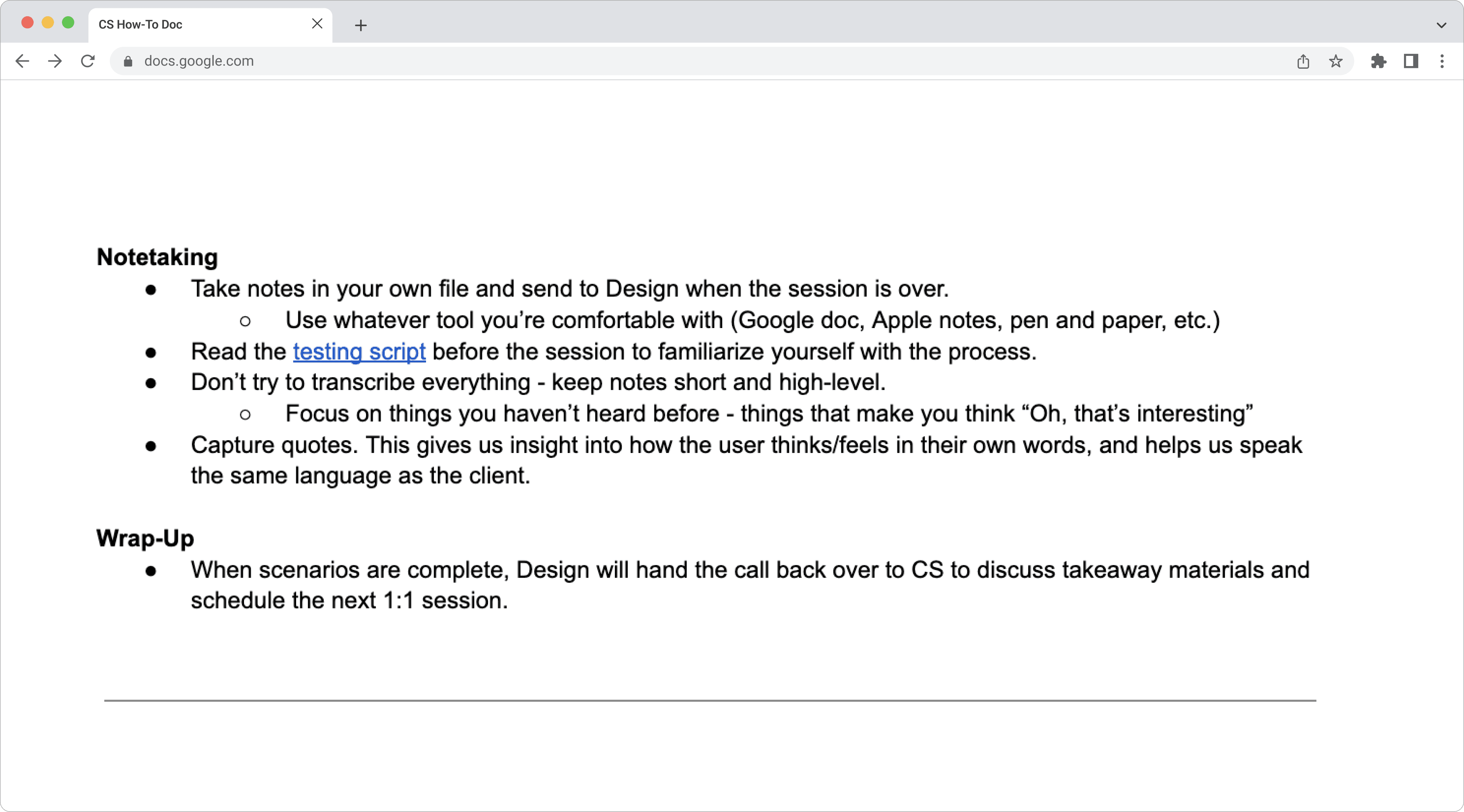
After aligning on responsibilities, we began working on the format of the actual sessions. I took the lead on making a “how-to” document for the Client Success and Product/SME teams so they were aware of the expectations of their role. This was circulated to all teams for feedback to provide everyone with an opportunity to ask questions or voice concerns.
Writing the script
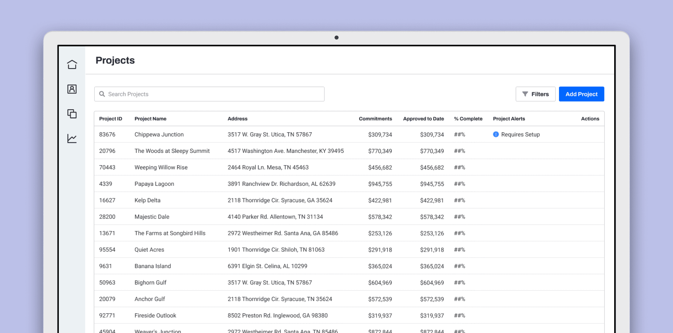
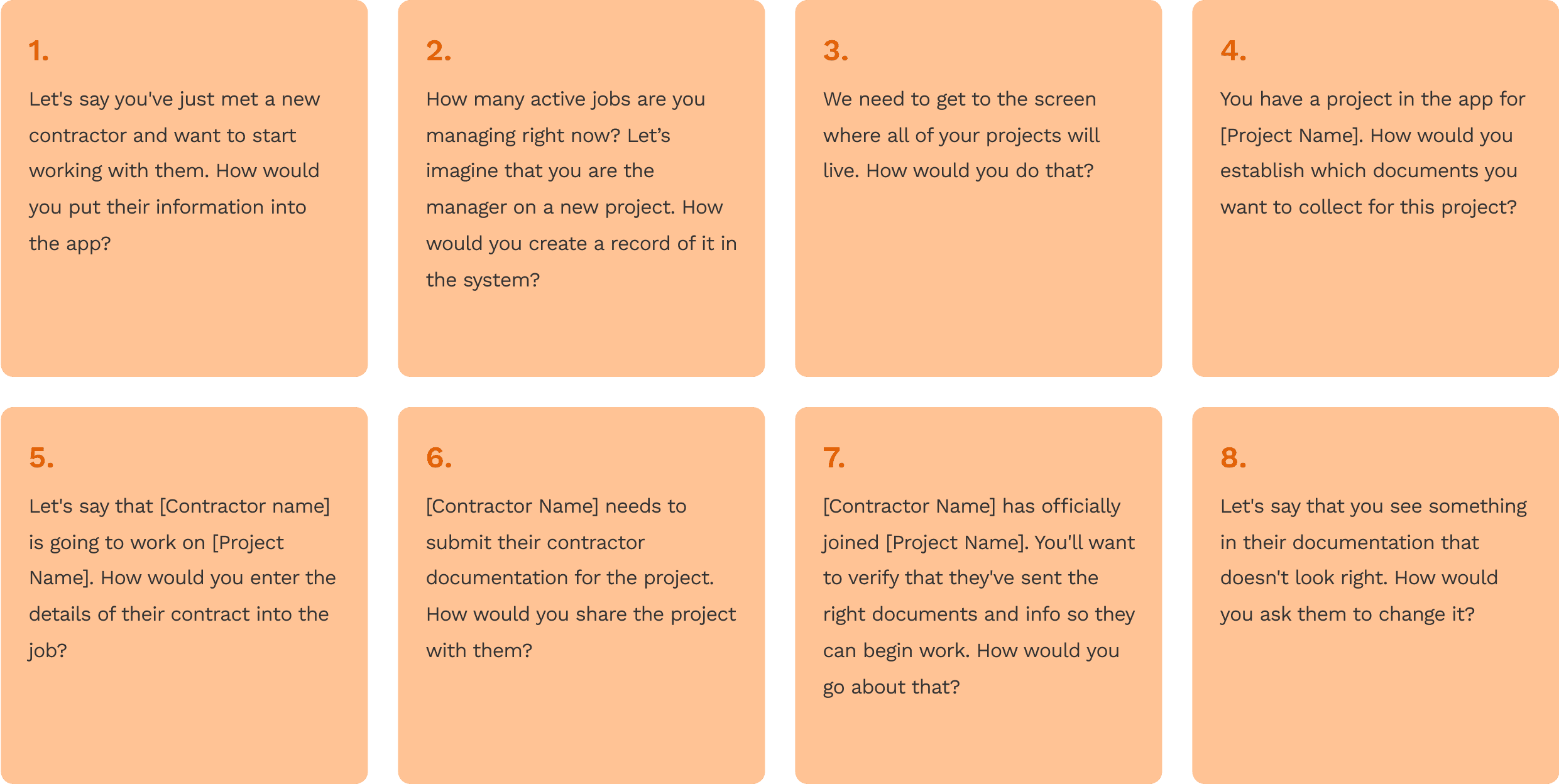
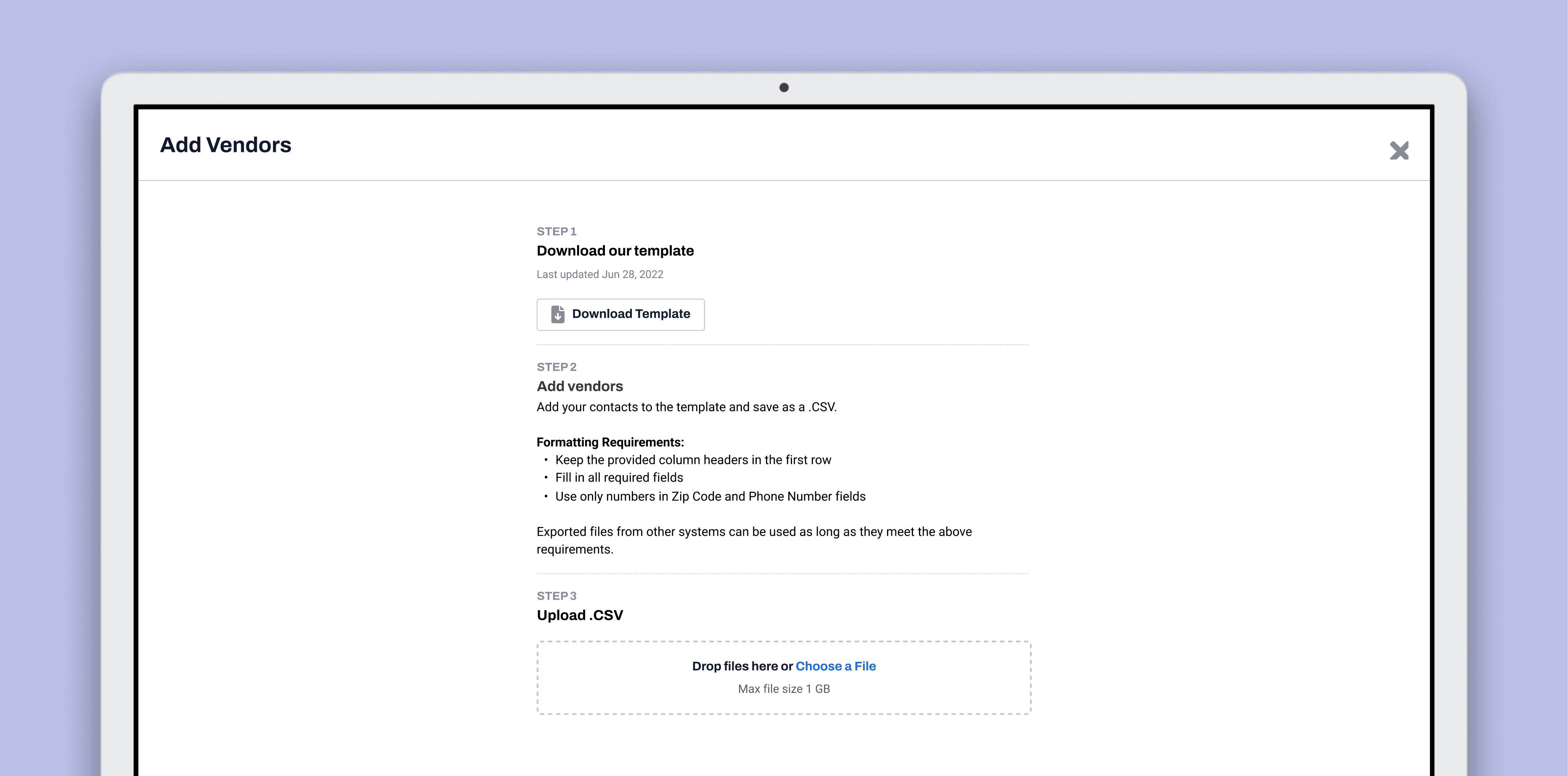
During this phase, I regularly collaborated with the Design Lead to establish a series of prompts that would allow us to determine whether the user could complete the tasks necessarily to fulfill their job duties. As with writing traditional usability test scripts, it was important to avoid asking any leading questions. The biggest challenge for this was not using the same verbiage in the prompts that we had already established in the software. For example, on one screen, there was a button that said “Create Vendor.” Asking a user “How would you create a vendor?” wouldn’t give us much insight. Instead, our prompt was “For our first scenario, let's say you've just met a new contractor and want to start working with them. They're called [Name], I've added their details in the Zoom chat. How would you put their information into the app?”
We also used this time to create mock data for our clients to use, so they didn’t have to use their real project information for testing purposes.
Cross-functional collaboration
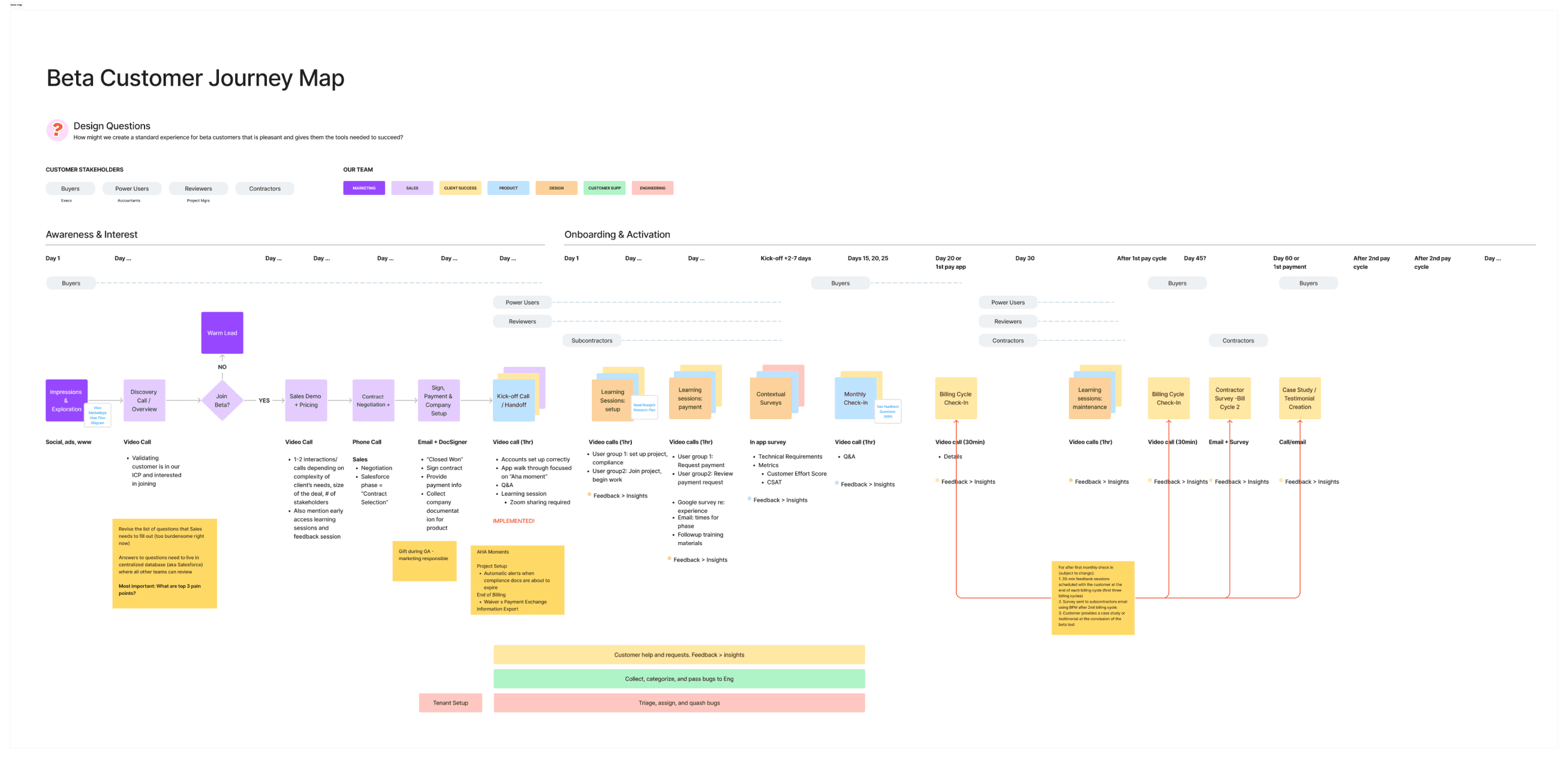
Since this was the first time that a project of this nature had been carried out at the company, the collaboration effort between different departments required intentionality. While we as designers were familiar with working with the Client Success and Training teams in terms of receiving client feedback, we had to be mindful of the established processes that came with onboarding, which was new territory. We brought Marketing, Sales, Client Success, Training, Product, Design, and Engineering together early on in the process to create a timeline for the different phases in which our users would interact with the software, and decide which teams would be responsible for which phases.
Taking notes
After aligning on responsibilities, we began working on the format of the actual sessions. I took the lead on making a “how-to” document for the Client Success and Product/SME teams so they were aware of the expectations of their respective roles. This was circulated to all teams for feedback to provide everyone with an opportunity to ask questions or voice concerns.
The primary objective of this document was to prepare everyone on how to take notes. For the first couple of sessions, the plan was to have all representatives from product, design, and client success on the calls - but we knew that was not sustainable long-term, as everyone had other commitments outside of this project. Eventually, the calls would consist of one product designer, who would always be the moderator; a CSM, who would take notes; and a product manager, who would act as the vendor so we could give clients a full picture of the process from their subcontractor’s perspective. Engineers would also be aware of the schedule so they could be on standby in case issues arise. It was important to ensure that the notetaker knew what to listen for and record. We explained some of the best practices and also linked out to some external resources for additional information.
Testing our user test
Once we felt like the script was complete, we had to get a little meta and do some mock sessions with account executives from a different department. They were familiar enough with the product and personas we were testing, but not so much that they could easily breeze through the test. This allowed to evaluate whether or not our format was easy to follow, predict where troubleshooting might need to occur, and give users better expectations when we sent the calendar invites. It also gave us the ability to practice transitioning from the user to one of our team members who were pretending to be our client’s subcontractors. There was some friction at first with switching between different accounts, but after a couple of these tests, we smoothed it out.
After implementing the feedback we got during our mock tests and troubleshooting with engineers where necessary, we were able to start scheduling sessions with clients. We outlined what technical requirements they would need to meet in order to participate: desktop computer or laptop, internet access, web browser. What to expect in terms of time: 5 min intros, 30-45 min for actual session, q&a / overall feedback remaining time.
The overview of these sessions were explained to clients by our sales & CSM partners during the kickoff call. To reiterate expectations, we included a short description in the calendar invites, which came from the client’s CSMs:
Our colleagues will prompt you with a few scenarios to help you complete real-life tasks. As you go through each task, you’ll be able to talk through what you’re thinking and they’ll answer questions.
We also advised them to test their login credentials ahead of the session to make sure there were no issues and to contact their CSM if there were.
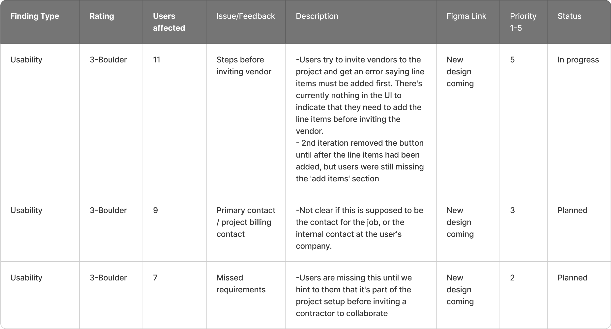
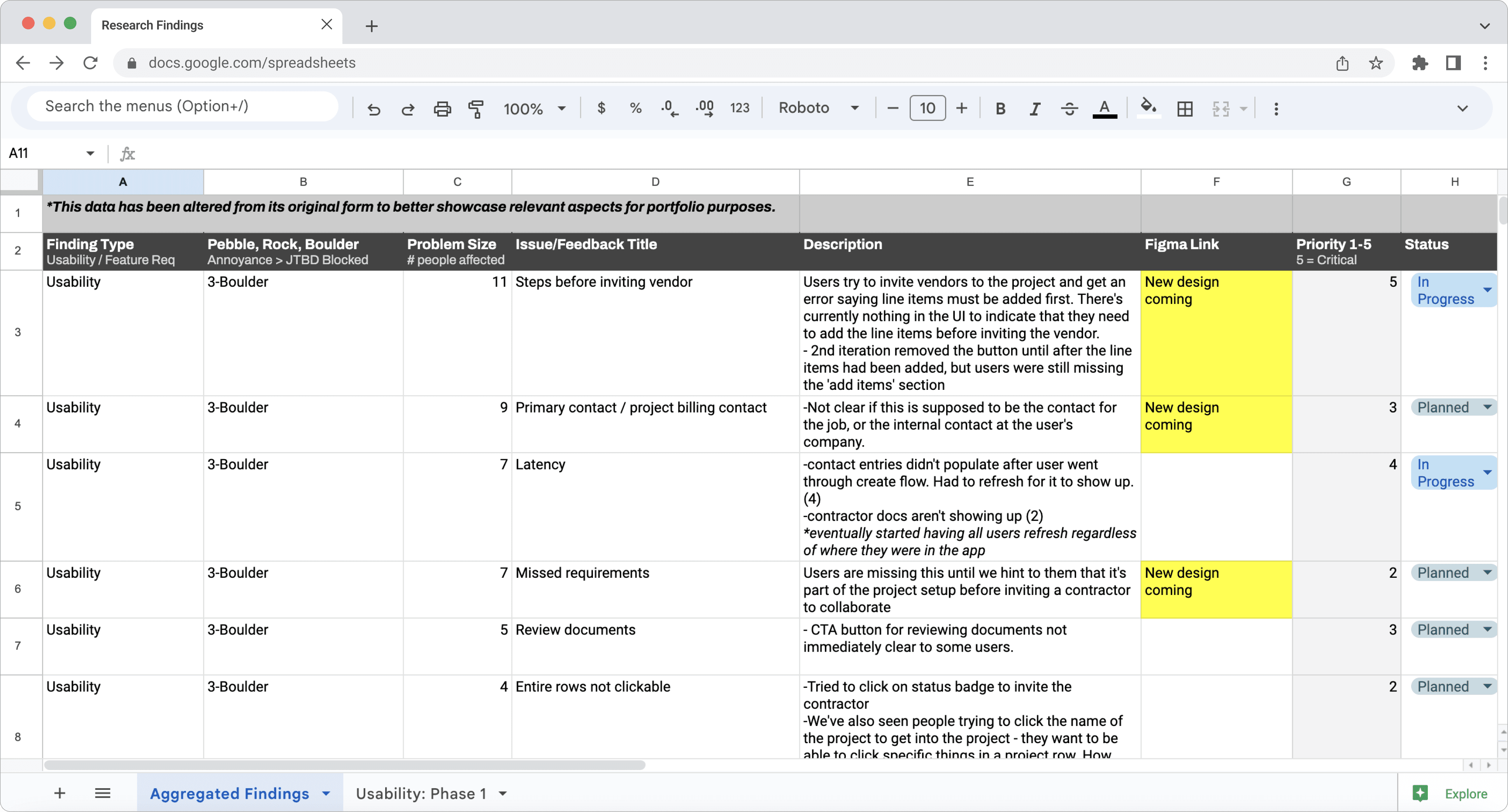
View the spreadsheet
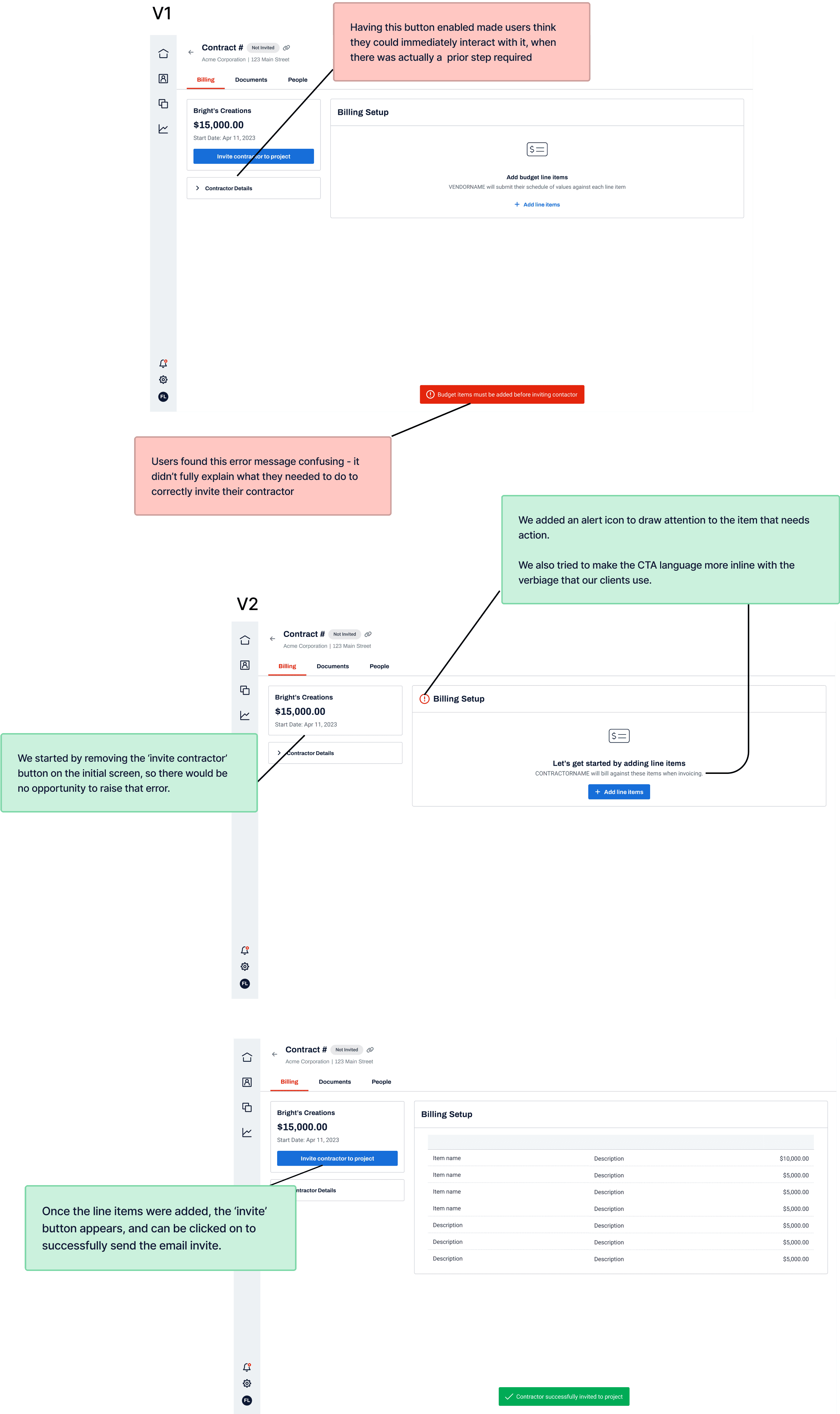
The first opportunity we had for a design iteration was after realizing that all users (6 at this point) had failed the task of inviting their vendors to a project. This was considered a boulder, as one of the main value propositions of our platform was the collaboration with other parties. Since the user’s confusion stemmed from unclear directions on how to invite the vendor, we implemented a quick fix that involved removing the ‘invite vendor’ button until all of the prerequisites were met.
Even with the new iteration, only 1 out of 13 users completed the task. This made it clear that we would need to re-think the entire workflow for our future clients.
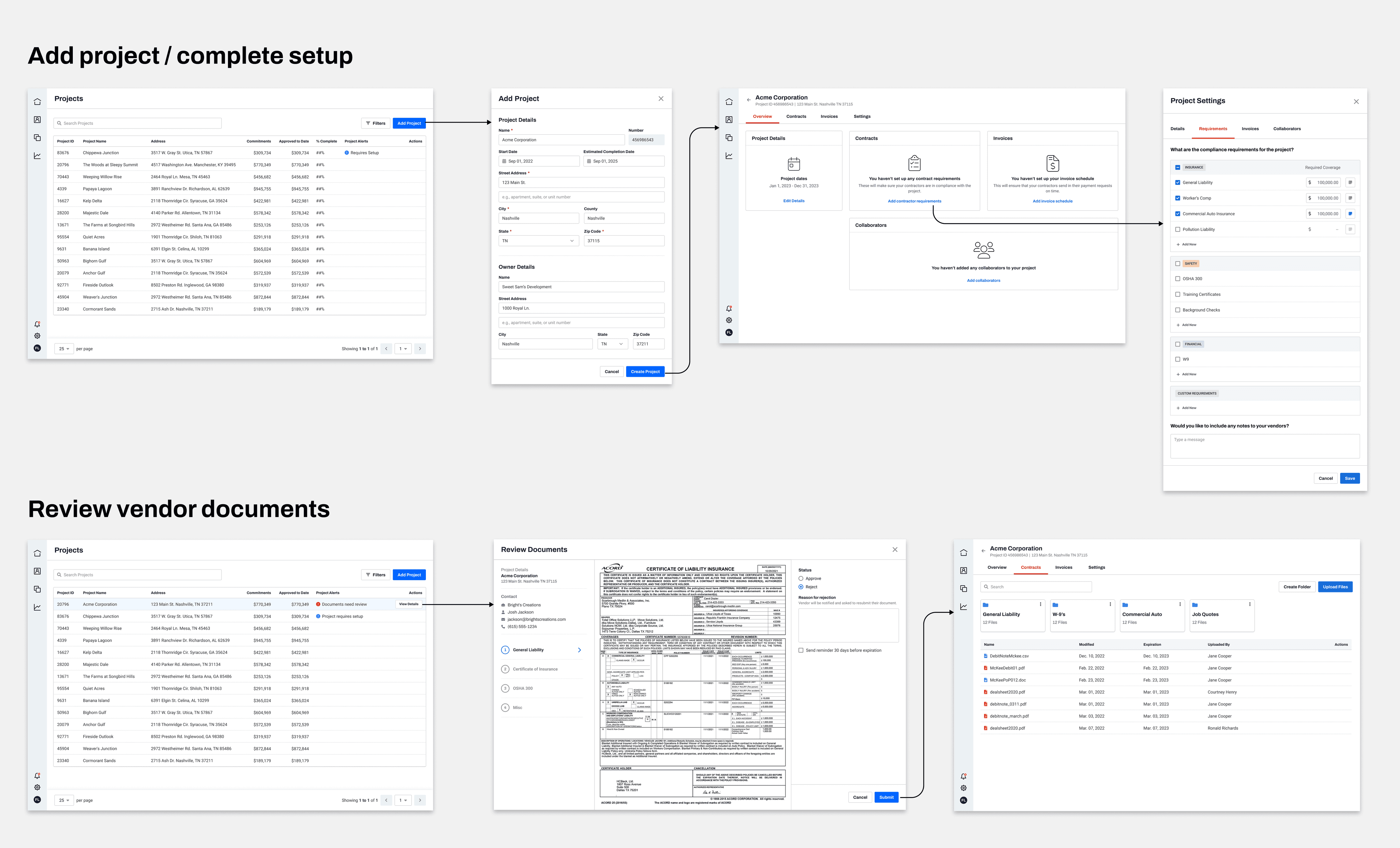
After these sessions were completed with our closed beta clients, we ended up with upwards of 30 items to fix before GA. The list included everything from bugs to re-designing entire workflows. As a result, the roadmap was shifted to account for these fixes before taking on any net-new work.
This project helped me learn how to pivot when users take unexpected routes, and how to get better about re-directing and asking probing questions. It also reinforced the need for thinking outside the box when faced with tight deadlines and release schedules. We often see design depicted as a very strict and linear process, when the reality is that user testing and validation is often overlooked for the sake of speed. In this situation, we did not have to completely sacrifice gathering feedback in order to get the product out the door.
More work ↓
