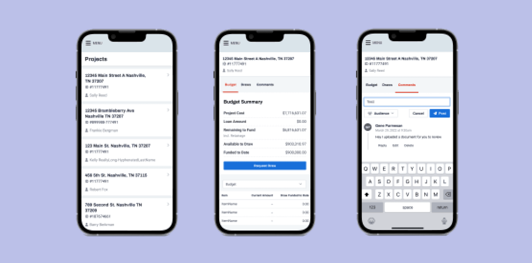
Originally, our consumer-facing product for borrowers with construction loans was designed exclusively for desktop use. However, with the growing prevalence of mobile devices, data revealed that 40% of our users accessed our software through mobile devices. Recognizing this trend, we employed a strategy that blended responsive and adaptive design philosophies to enhance the navigation and streamline essential tasks, with the goal of making our product more user-friendly across various devices.
We encountered a significant concern regarding our user experience during the planning phase of migrating users from our old codebase to a new one: the absence of a genuinely mobile-friendly experience. As we began creating our go-to-market strategy, it became evident that promoting a new and improved user experience would be challenging without optimizing for mobile, considering it caters to 40% of our user base.
Our company presented itself as a mobile-optimized web application catering to all users, but users were not finding this to be true. Though we consistently made minor updates over the last few years to improve functionality for key workflows - such as requesting a draw and inspection, and accessing fundamental information related to a loan - none of those workflows underwent mobile-specific design, development, or testing. Qualitative observations through our session replay tool indicated that many users attempted certain actions, such as itemized draw requests, but ultimately abandoned these tasks due to the lack of true mobile-friendliness in the responsive view.
Our mobile strategy had been constrained to solely employing responsive web design techniques - meaning, we maintained a single HTML structure and utilized different CSS to target various "break-points" in the browser, redrawing or hiding specific elements depending on the viewport size (mobile vs. desktop). While this approach enabled us to build one application with a unified layer of business logic, it also came with downsides, as it restricted our flexibility in each of these aspects.
Our approach for this specific use case was to blend together adaptive and responsive components. Adaptive components allow us to completely switch interface elements based on the device or screen context. In essence, these user interface components dynamically adjust to their environment, providing the most context-friendly interface.
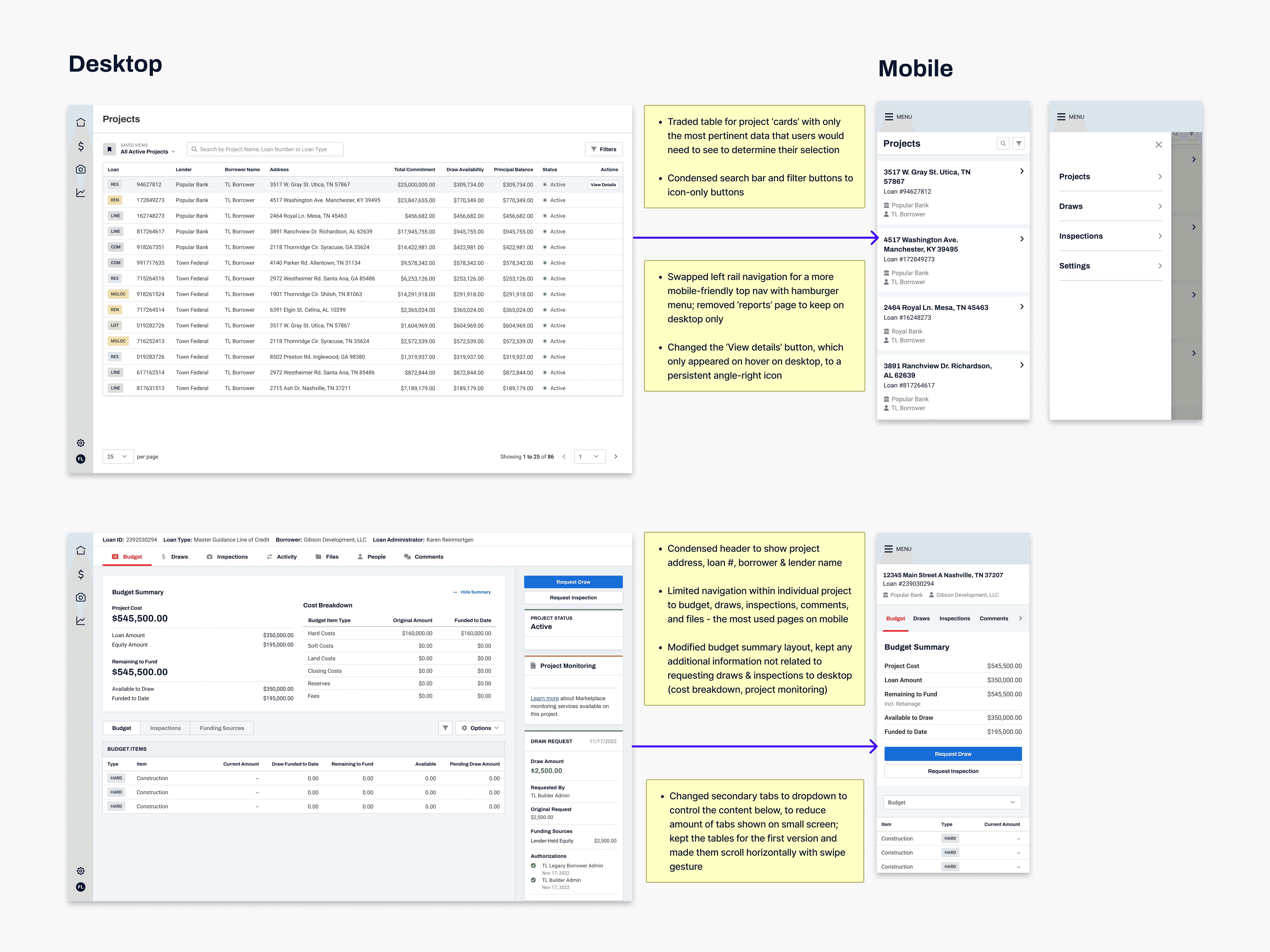
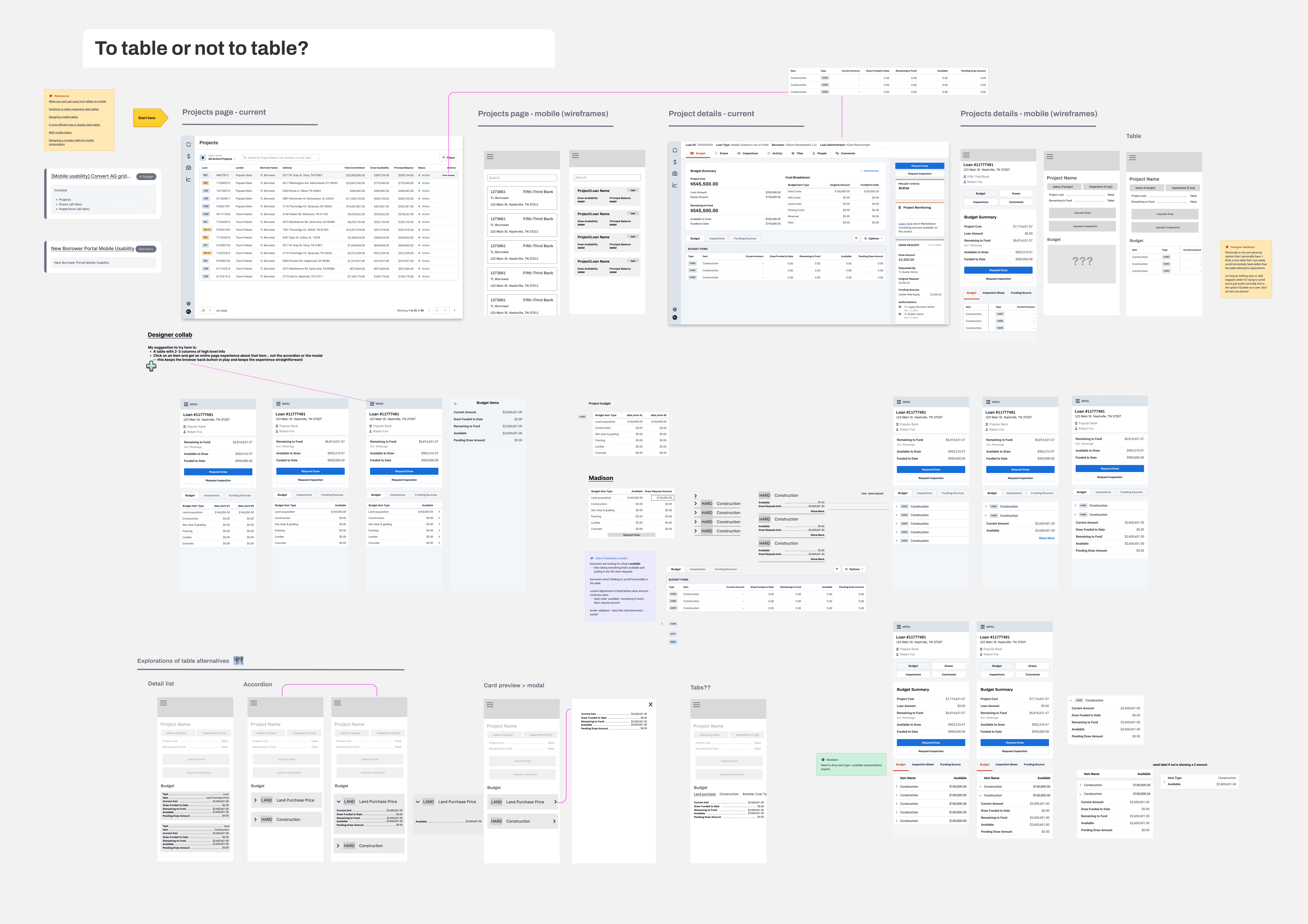
Let's use a complex data grid as an example - a familiar desktop element, and something that is very prominent throughout our software. The adaptive strategy in this case involved presenting a more straightforward list view with an option to click into the list item for more details when needed. Embracing this level of flexibility within the mobile context makes it significantly easier to design the ideal user experience for mobile use cases - one that conforms to the smaller screen size and that limits cognitive overload.
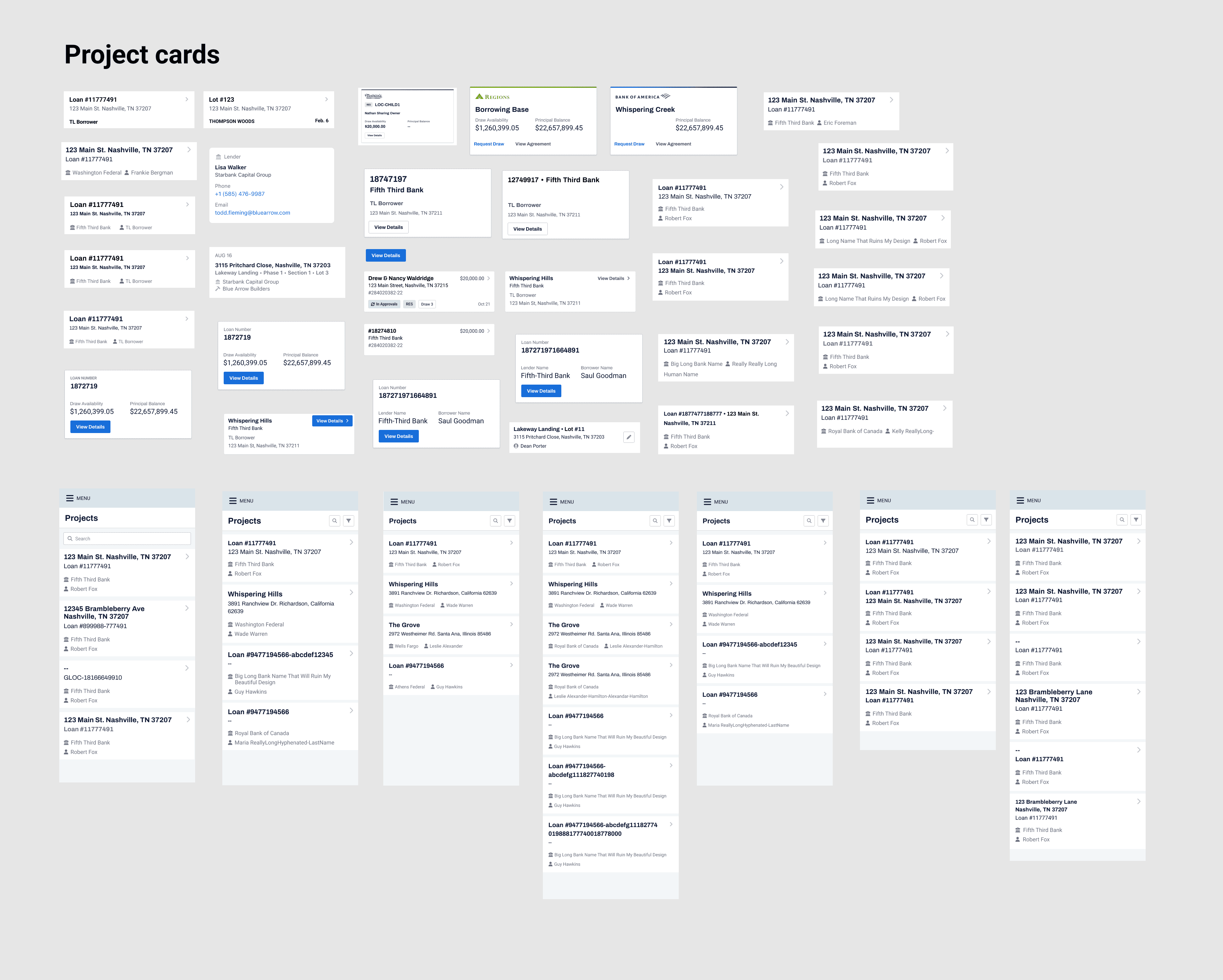
Ultimately, our strategy involved approaching this task in phases. We initiated our work by prioritizing the pages with the highest traffic, focusing on optimizing them with mobile-friendly components such as cards.
After conversations with the engineering team and business stakeholders, we realized that the biggest constraint of this project would be time. We had a target date for bringing all users over from our legacy tech onto the new platform, so there was no opportunity to completely re-design the existing workflows for a mobile experience - I would need to design to fit what was currently available.
Conducting an audit
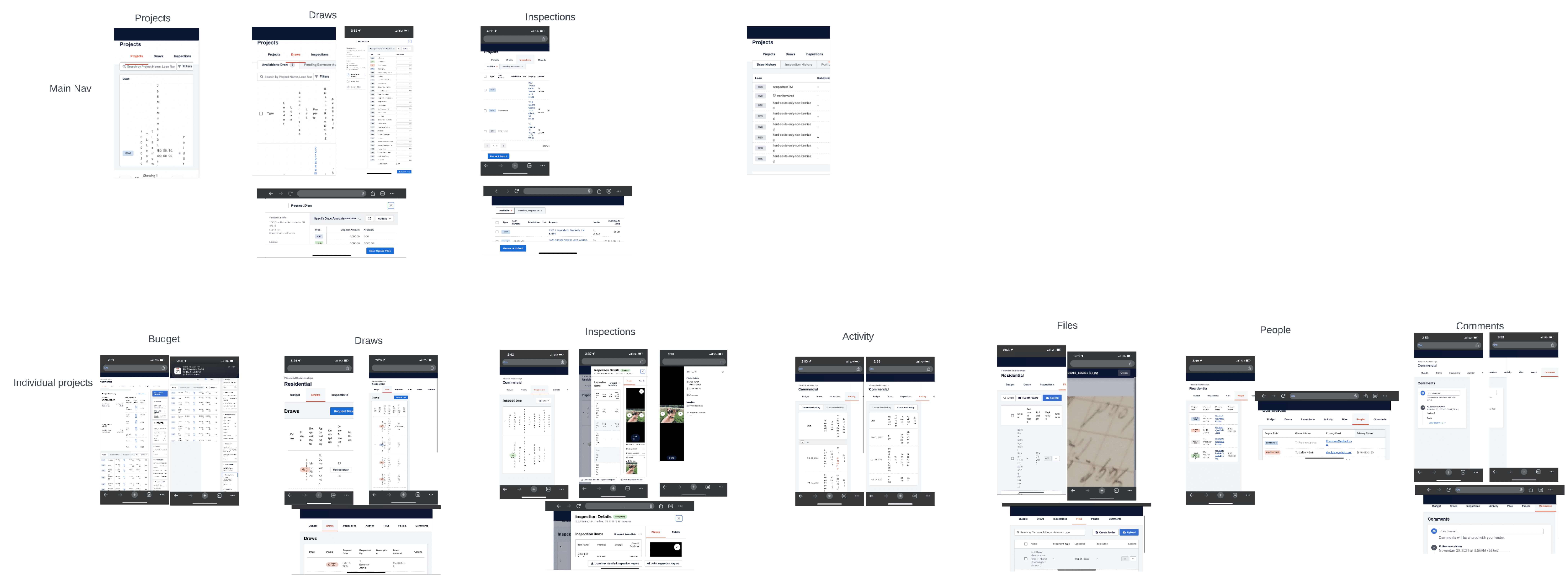
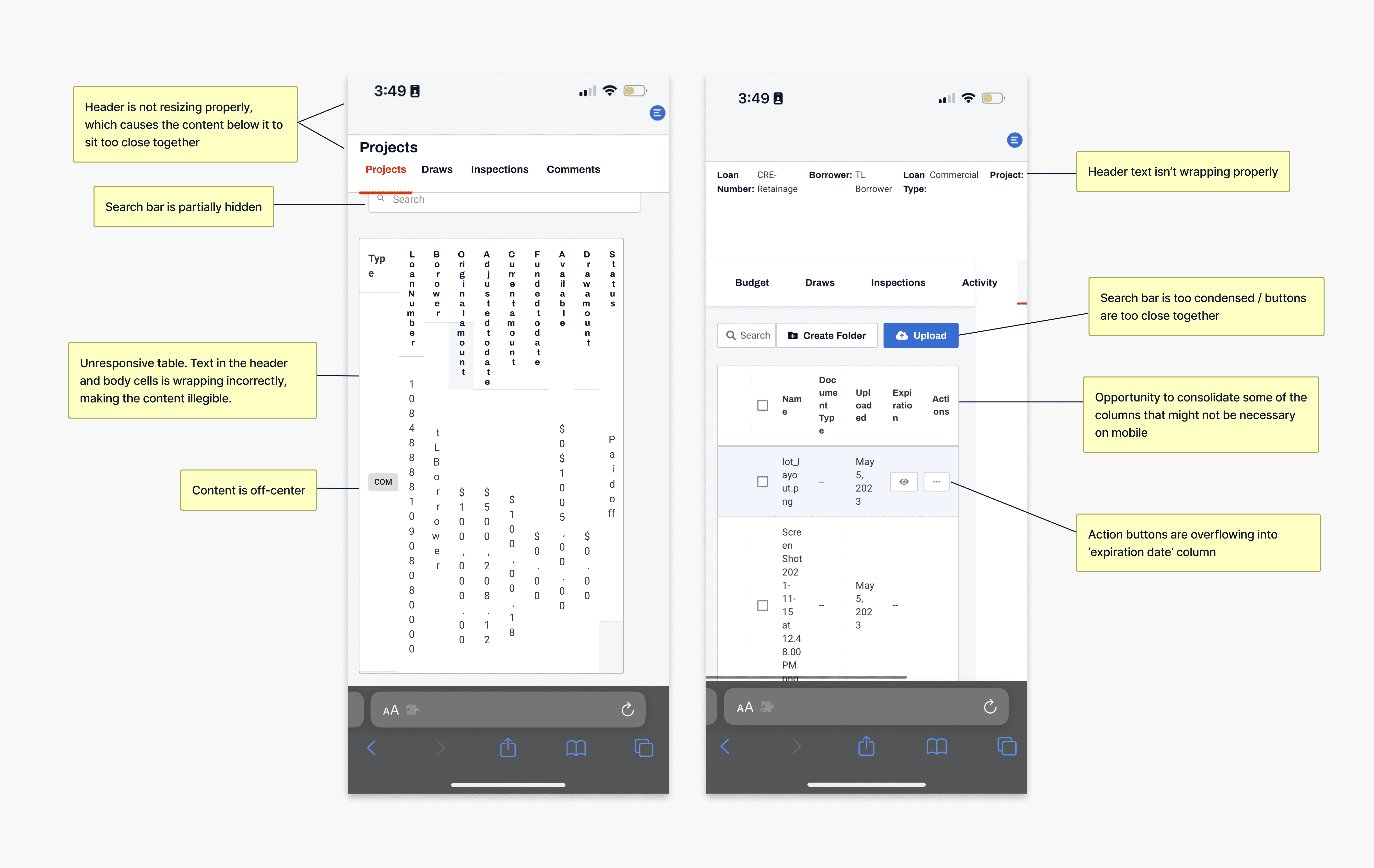
After aligning on a strategy, myself and the Product Manager kicked off the project by conducting an audit of the current mobile experience of our product to identify gaps and areas of improvement. Upon first glance, the most noticeable concern was the illegibility of text within the tables. Rather than having the table overflow with horizontal scroll enabled, the columns were resizing to fit the width of the page, making all of the content within them wrap vertically.
Prioritizing functionality
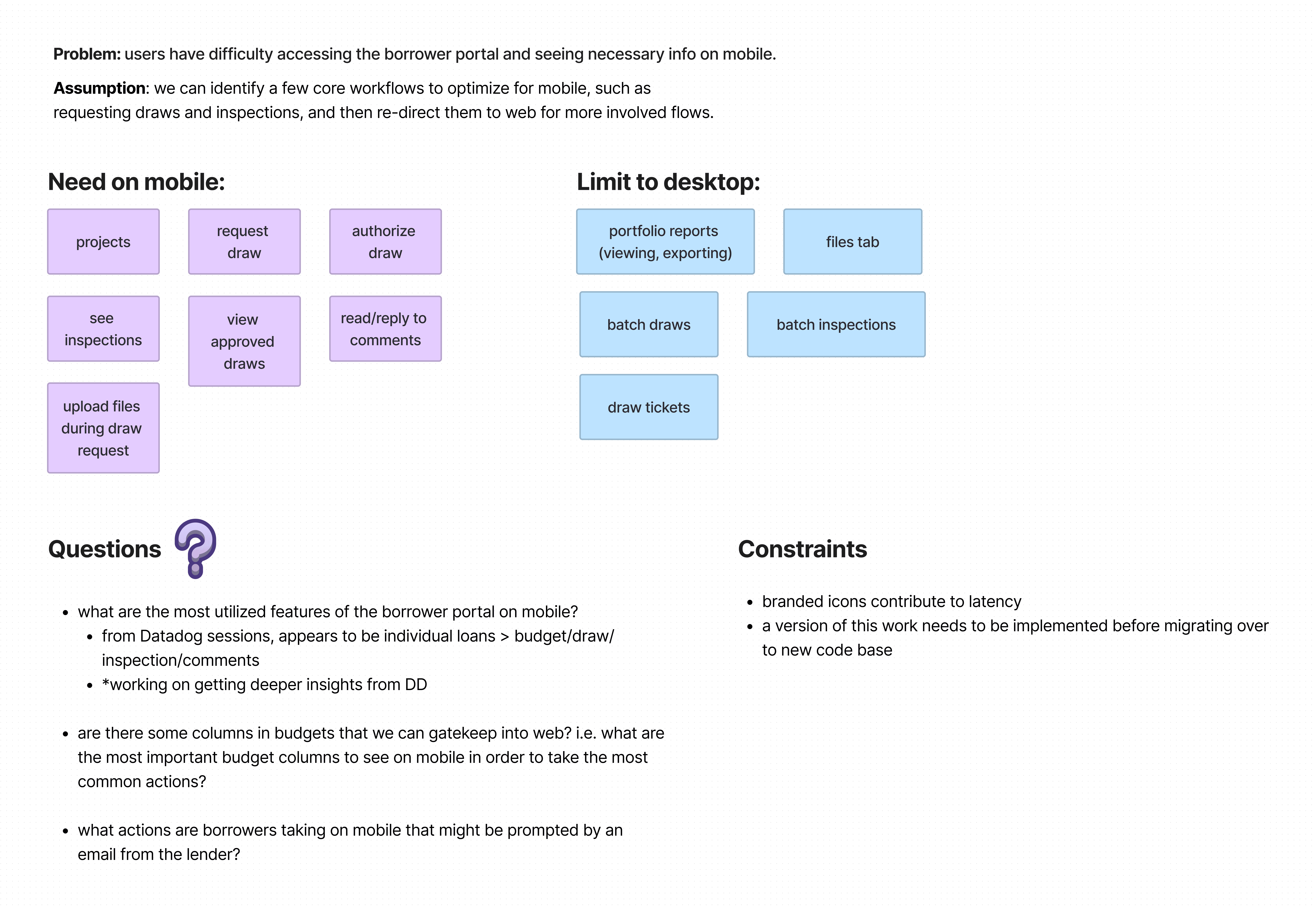
We also used Figjam for a brainstorming session about which aspects of our product were critical to have on mobile, and which ones were nice-to-haves. This allowed us to prioritize the work starting with the most heavily utilized features on mobile, and potentially limiting anything that lacks a mobile audience to desktop only. For example: upon logging into our system, users are immediately directed to a list of their projects in table form, so we knew we needed to start with this page and explore potential design patterns to swap for the table.
For the first version, we set out to optimize:
Viewing the list of projects
Viewing details related to a specific project
Requesting a draw
Adding comments on a project
Managing files on a project
Inspiration
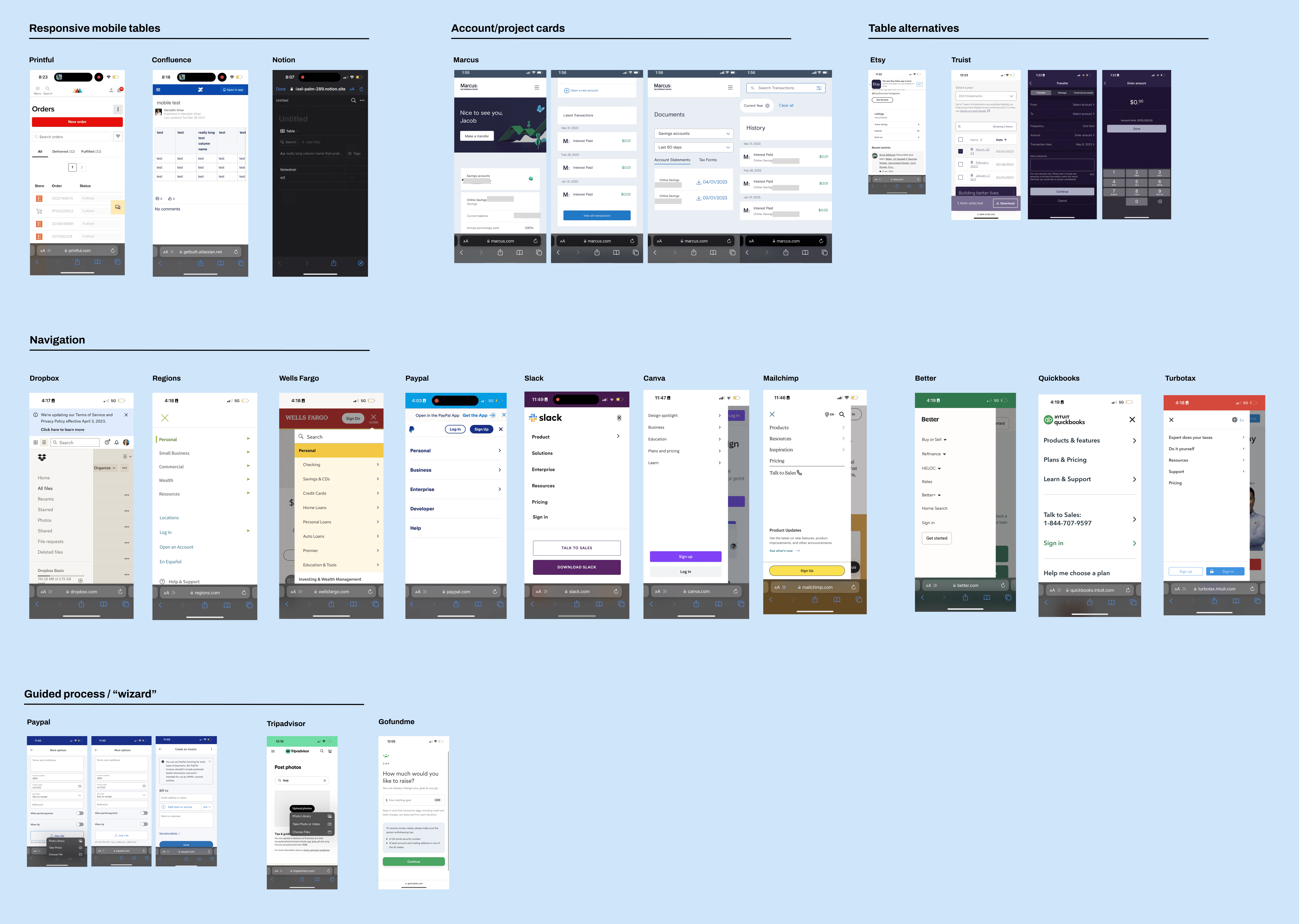
With more insight on the direction we were taking, I began looking for examples of relevant mobile patterns that would fit our use cases, both internally and externally. Although the only mobile work that went into production was for our native inspections app, I wanted to see if there was any potential to carry over native mobile patterns to a mobile web format, as well as ensuring consistency with our brand identity. We also had an archive of previous mobile explorations for other products that I was able to draw inspiration from. I looked to other programs such as Paypal and online banking platforms like Truist and Marcus for examples of multi-step processes, like initiating a transfer.
Wireframes
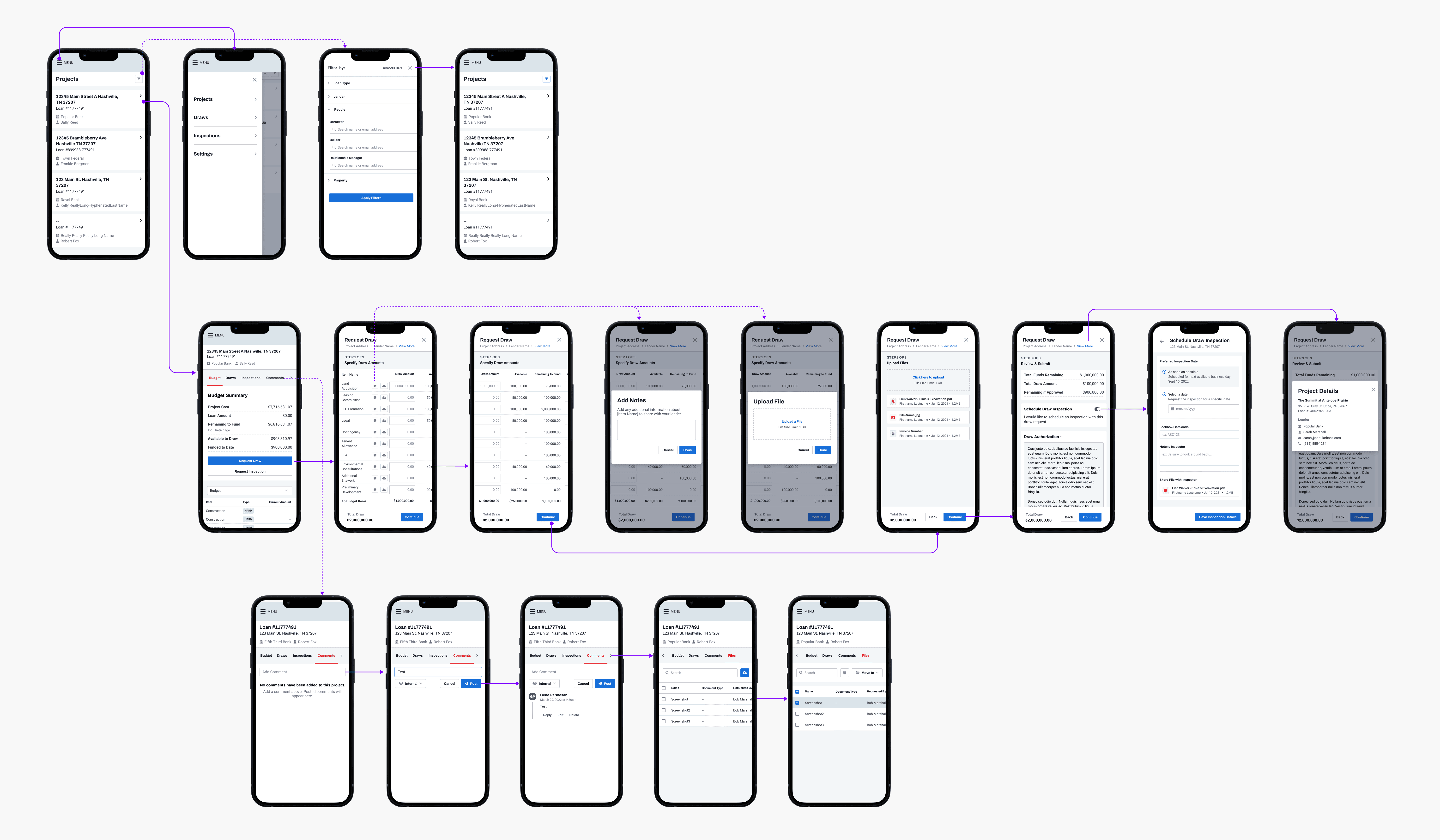
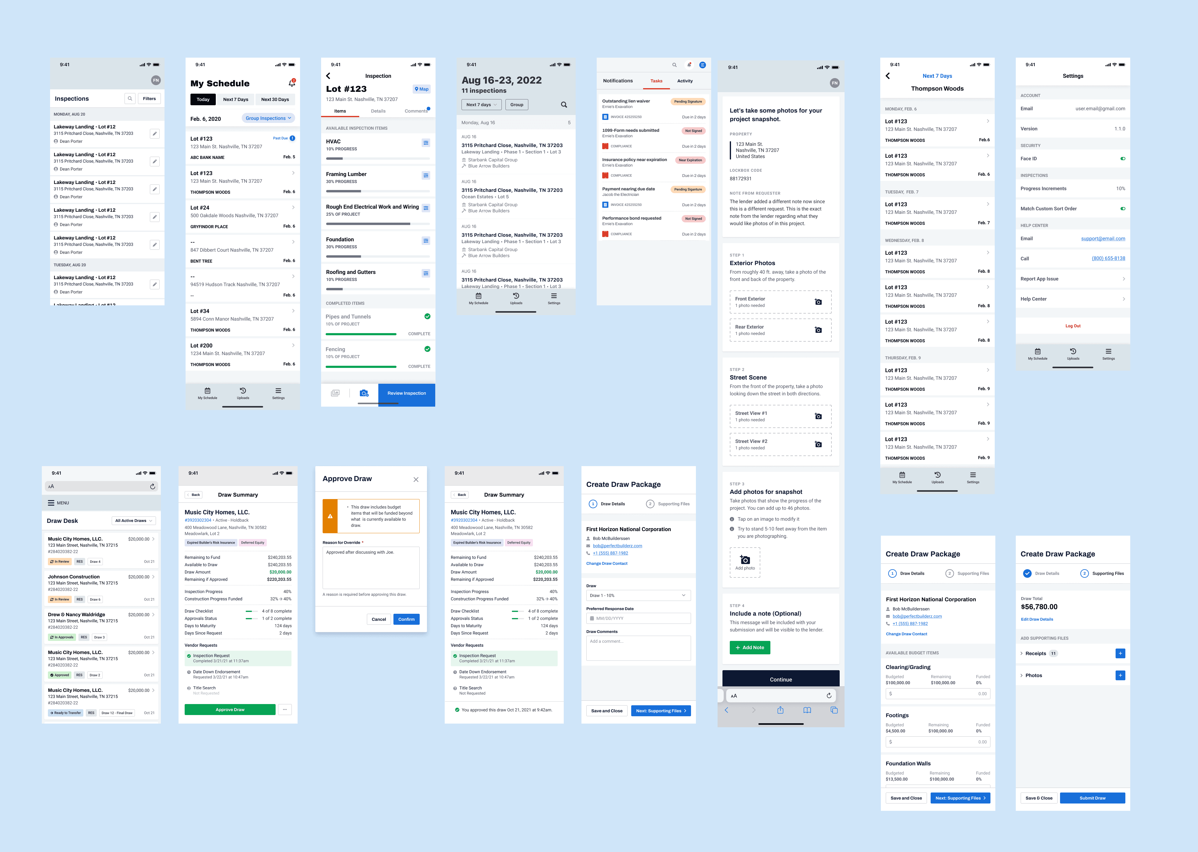
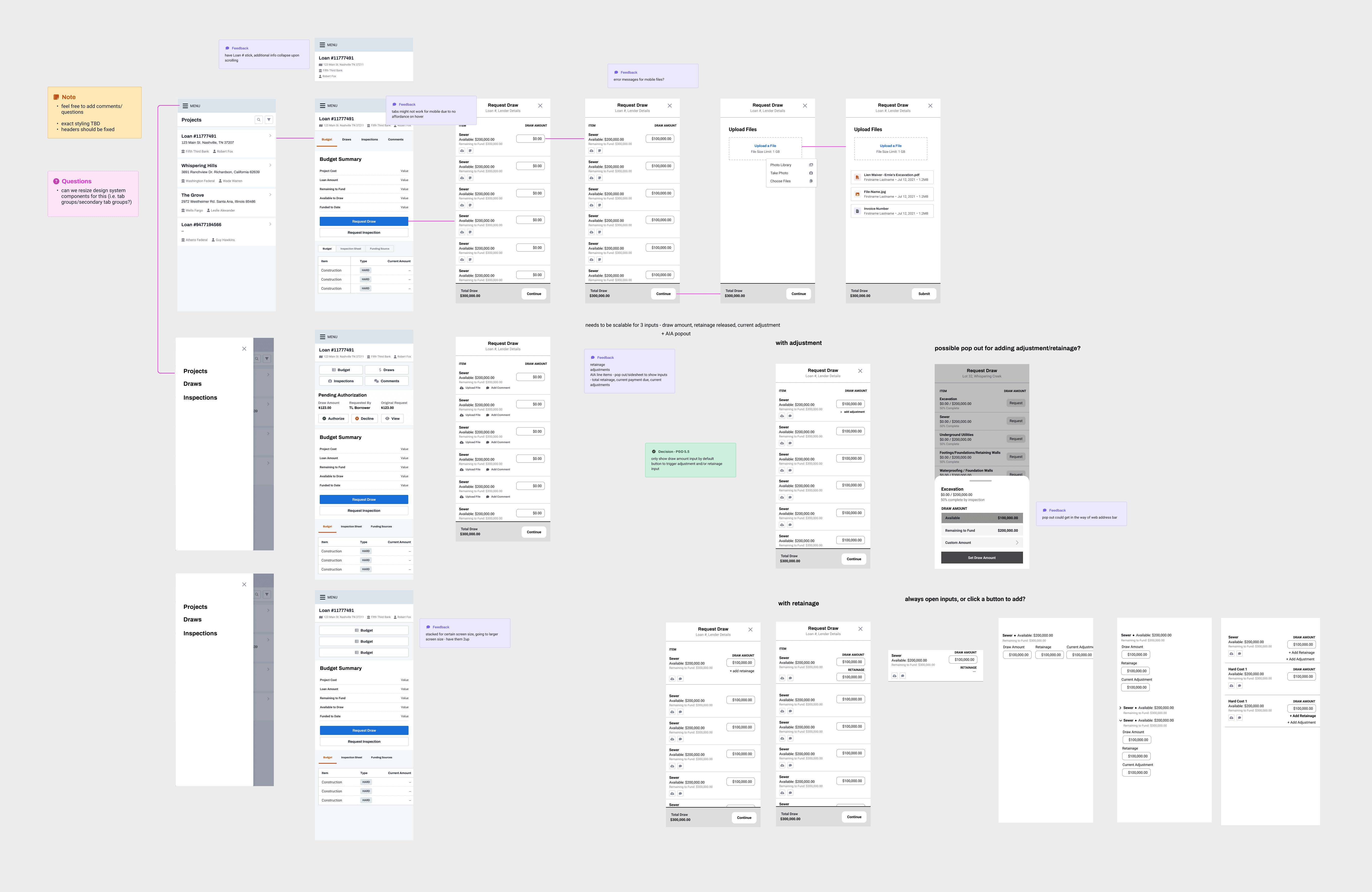
Since we were taking existing functionality and adapting it to a different screen size, I was able to go directly to putting together wireframes for our key workflows. I did several iterations of wireframes that were all presented to the broader design team for feedback.
Presenting to the team
After spending a few days heads down in Figma and working closely with the PM, I put together a proposed end-to-end flow to present to the engineering team. This gave them the opportunity to voice any concerns about functionality or bring up any technical constraints.
Pushing pixels
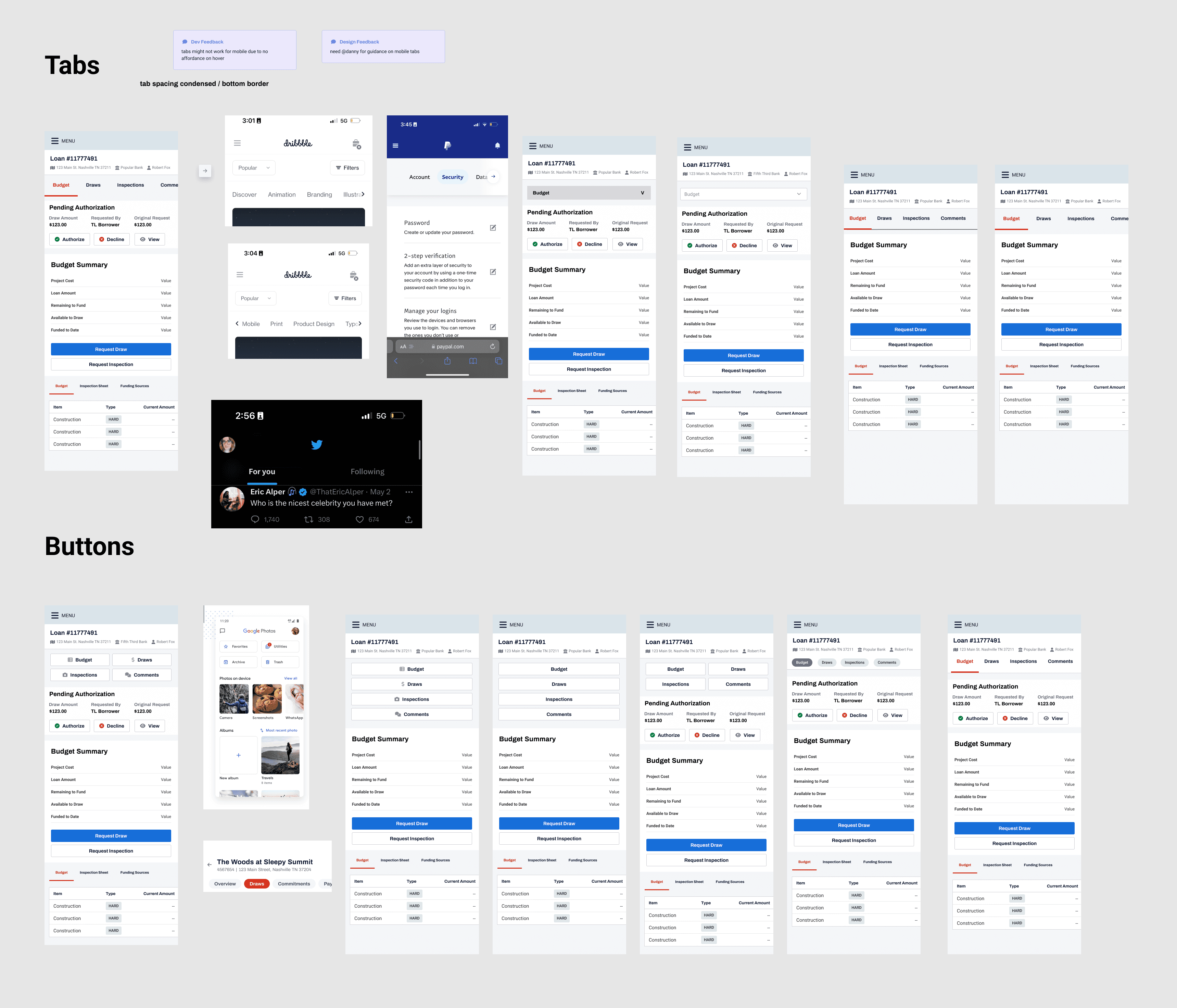
Now with feedback from design, product & engineering teams, I felt confident enough to move into more mid-high fidelity designs, trying to focus on one pattern at a time. I took this approach to the design of the project cards, and our secondary navigation within a project page. I also began exploring other alternatives to tables for future use cases where the project cards didn’t translate seamlessly.
Knowing that some of the lower priority content on these pages would need to remain in a table format for the time being, our engineers worked to make sure that any remaining tables were truly responsive - enabling horizontal scroll, and working with me to resize column widths, eliminate columns that were not absolutely necessary to the primary user tasks, and truncating text where possible.
A less than desirable outcome
As designers, it’s natural that we want to showcase projects that produced tangible results. Unfortunately though, sometimes our work never sees its intended audience - including this project of mine. Leadership decided to take the product strategy in a different direction, and resourcing was no longer allotted to this endeavor. The designs were never tested for validation or deployed to our end users. Despite that, this time was well spent for me as a designer, as it was my first opportunity to work with mobile patterns during my time at this company.
Had I been able to continue working on this feature, I would have put together a prototype of the full workflow encompassing viewing and selecting a project and requesting a draw and tested it with our most active mobile users to determine whether or not they could successfully complete those tasks.
I would have also continued to advocate for our mobile strategy to pivot from reactive to proactive, meaning that we design for mobile alongside desktop instead of only treating mobile usability problems as they arise.
This scope of work helped reinforce that in today's world, mobile can no longer afford to be an afterthought in a product, especially with consumer-facing software. It also gave me more familiarity with common mobile patterns, and more experience with designing intentionally. In designing for desktop, it can be tempting to add unnecessary elements to fill space. Designing for mobile was the opposite experience for me, and I learned how to really lean into the research tools at our disposal to find out what is most important for our users.
More work ↓
